- CS 725/825 - Information Visualization, Dr. Weigle
- CS 495/595 - Introduction to Web Science, Dr. Nelson
--Michael
We study literature as a living thing, able to adapt to society’s desires and able to influence those desires. Currently, we are tracking the evolution of pulp science fiction short stories published between 1926 and 1999. Just as a biologist might ask the question, “How does a preference for mating with red-eyed males effect eye color distribution in seven generations of fruit flies?” the GEP might ask, “How does the increasing representation of women as authors of science fiction affect the treatment of medicine in the 1960s and beyond?”In addition the slides (when they're available), you might be interested in his SF course on Coursera.
Sawood Alam, HTTP Mailbox - Asynchronous RESTful Communication, MS Thesis, Computer Science Department, Old Dominion University, August 2013.
“@tpdl2013: Best Student Paper Award #tpdl2013http://t.co/JPllioad3k” @aalsum@yasmina_anwar@weiglemc
— Michael L. Nelson (@phonedude_mln) September 25, 2013
If you recall, way back in 2012, Kalpesh Padia (now at N.C. State under Christopher Healey) and Yasmin AlNoamany (@yasmina_anwar) presented "Visualizing Digital Collections at Archive-It", a paper presented at JCDL 2012, which was the product of Dr. Michele C. Weigle's (@weiglemc) pair of infovis-related courses at Old Dominion University (ODU): CS825 - Information Visualization and CS895 - Applied Visual Analytics.
Like Kalpesh and Yasmin, I have turned a semester project into a conference submission with a poster/demo accepted to IEEE VIS 2013: Graph-Based Navigation of a Box Office Prediction System. The impetus for this strangely out-of-topic (for this blog's theme) submission has roots in the IEEE Visual Analytics Science and Technology (VAST) Challenge, a competition where a large data set is supplied to contestants and a meaningful visual representation is created with each submission. Both Kalpesh and I had previously participated in the VAST Challenge in 2011 (see a summary of my Visual Investigator submission) yet neither of us attended the conference, so without further ado, the Trip Report.
I arrived on Wednesday morning, setup my poster, and headed off to the first session, which consisted of "Fast Forwards" of the papers. This summary session is akin to the "Minute Madness" at JCDL and allows conference attendees to get a glimpse at the many papers to be presented and to choose which concurrent session to attend. The one that piqued my interest the most was the InfoVis Papers session: Storytelling & Presentation.
With the completion of the Fast Forward Summaries, I headed over to the Atrium Ballroom of the Atlanta Marriott Marquis (the conference venue, pictured above) to first see Jessica Hullman of University of Michigan present "A Deeper Understanding of Sequence in Narrative Visualization" (full paper).
In the presentation she stated, "Users are able to understand data if they're seeing the same type of transition repeatedly." In her study, her group created over fifty presentational transitions using public data with varying type and cost (she describes the latter as a function in the paper). From the study, she found that low cost transitions are preferred, temporal, temporal transitions are easy to grasp and hierarchical transitions were the most difficult for the user.
She then created 6 visualizations with and without parallel structures and utilized them in a timed presentation given to 82 users. She then asked for the transitions to be compared and explained as well as requested the user to recall the order of the content. With further studies on the topic she was able to confidently conclude that "Presentation order matters!" and that "Sequence affects the consumption of data by the user."
Following Jessica, Bongshin Lee (@bongshin) of Microsoft Research presented "Sketchstory: Telling More Engaging Stories with Data through Freeform Sketching". Sketchstory is a means of utilizing underlying data in interactive presentations, as is done on an interactive whiteboard. Bongshin demonstrated the product by showing that just through gesturing, data can be immediately plotted or graph in a variety of Powerpoint-esque figured to help a presenter explain data interactively to an audience. The system is capable of drawing icons and axes while utilizing the data on-the-fly, which makes it suitable for storytelling.
In a study of the product, Bongshin's group found that users enjoyed the presentations given with Sketchstory more than Powerpoint presentations, felt they were more engaged with the presentations and that the presenters felt the system was easy enough to learn. However, possibly due to previous familiarity with Powerpoint, most presenters felt that creating a presentation in Sketchstory required more effort than doing so in Powerpoint.
In followup questions to the presentation, one audience participant (at the conference, not in the study) asked how engagement was measured in the study, to which Bongshin replied that questions were asked using a Likert scale. When another audience member asked where they could try out the software to evaluate it for themselves, Bongshin relied that it was not available for download and that is only suitable for internal (Microsoft) use."
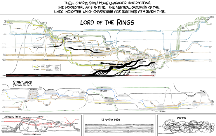
The next presentation was on StoryFlow, a tool (inspired by the work of Randall Munroe, illustration pictured) for creating storyline visualizations interactively. The authors determined that in order to be more effective of a visualization, the timeline plot needed to reduce the number of edge crossings and minimize whitespace and "wiggles", with the latter referring to unnecessary movements for association in the graph.
The authors mathematically optimized the plots using quadratic programming to facilitate ordering alignment and compaction of the plots. Evaluation was done by comparing the plots generated against a genetic algorithm method and Randall's method. From their work, the authors concluded that a storyline visualization system was an effective hybrid approach at producing the graphs through being aware of the hierarchy needed based on the plots. Further, their system provided a method for interactively and progressively rendering the graphs if the user though a more visually pleasing layout is preferred.
The fifth and last presentation of the Storytelling and Presentation session was "Visual Sedimentation", a interesting approach at showing data flow. "Data streams are everywhere but difficult to visualize.", stated Samuel Huron (@cybunk).
Along with Romain Vuillemot (@romsson) and Jean-Daniel Fekete (@jdfaviz) of Inria, their early work started in visualizing political Twitter streams during the French 2012 presidential elections, and social interactions during a TV show. Through an effect of compaction, old data is "merged" into the total value to escape visual clutter and provide an interesting accumulation abstraction. The video (below) gives a good overview of the work but for those technically handy, the project is on Github.
After a short coffee break, I attended the next session wherein Carlos Scheidegger (@scheidegger) presented "Nanocubes for Real-Time Exploration of Spatiotemporal Datasets". Nanocubes are "a fast datastructure for in-memory data cubes developed at the Information Visualization department at AT&T Labs – Research". Based on Data Cubes by J. Gray et. al along with many other works well known in the Vis community (e.g., by Stolte, Mackinlay, Kandel and other works) Carlos showed how they went about extracting the information necessary based on two location fields and a device field aggregated to create a summary record.
Carlos' summation of the project were the nanocubes enabled interactive visual interfaces for datasets that previously were much too large to visualize. Further, he emphasized that these data sets did not have massive hardware requirements but instead, the system was designed to allow exploration of the data sets from a laptop of cell phone. The project is open source with the server back end written in C++11 and the front end written in C++11, OpenGL, JavaScript, D3 and a few other technologies.
After Carlos, Raja Sambasivan (@RS1999ent) of Carnegie Mellon University presented "Visualizing Request-Flow Comparison to Aid Performance Diagnosis in Distributed Systems". "Distributed Systems are prone to difficult-to-solve problems due to scale and complexity", he said. "Request flow show client-server interaction".
After Raja, Michelle Borkin (@michelle_borkin) of Harvard presented "Evaluation of Filesystem Provenance Visualization Tools" in which she initiated the talk by introducing file system provenance through the recording of relationships of reads and writes on the file system of a computer. The application of recording this information might lie in "IT Help, chemistry, physics and astronomy", she said. Through a time-based node grouping method algorithm, data is broken up into groups by activity versus being a whole stream grouping or a simple marker for the start of activity.
She illustrated various methods for visualizing file provenance showing a side-by-side of how a node-and-link diagram gets unwieldy with large data sets and expounding on the radial graphs as an alternative is preferable.
A running theme in the conference was the addition of a seemingly random dinosaur on the slides of presenters. The meme originated with Michelle's presentation on Tuesday titled "What Makes a Visualization Memorable?" (paper) in which, she was quoted as saying, "What makes a visualization memorable? Try adding a dinosaur. If that’s not enough, add some colors." With this in-mind, dinosaurs began popping up on the slides each author felt was the take-home of his/her presentation.
Following Michelle, Corinna Vehlow presented "Visualizing Fuzzy Overlapping Communities in Networks". "There are two types of overlapping communities: crisp and fuzzy.", she continued, "Analyzing is essential in finding out what attributes contribute to each of these types." Her group has developed an approach for utilizing undirected weighted graphs for clarifying the grouping and representing the overlapping community structure. Through their approach, they were able to define the predominant community of each object and allow the user of their visualization to observe outliers and identify objects with fuzzy associations to the various defined groups.
After Corinna, Bilal Alsallakh (@bilalalsallakh) presented "Radial Sets: Interactive Visual Analysis of Large Overlapping Sets". In his talk, he spoke about Euler diagrams' limited scalability and the concept he created called "Radial Sets" that allows association to be encoded using relative proximity. The interactive visualization he created allowed for interactivity wherein extra information could be accessed (e.g., set union, intersection) by holding down various keyboard modifiers (e.g., alt, control). By using a brushing gesture, sets could be combined and aggregate data returned to the user.
The conference then broke for a long lunch. Upon returning, a panel commenced titled "The Role of Visualization in the Big Data Era: An End to a Means or a Means to an End?" with Danyel Fisher (@FisherDanyel), Carlos Scheidegger (@scheidegger), Daniel Keim, Robert Kosara (@eagereyes), and Heidi Lam. Danyel stated "The means to an end is about exploration. The ends to a means is about presentation". He noted that a lot of big data is under-explored. In 1975, he illustrated, big data was defined in VLDB's first year as 200,000 magnetic tape reels. He cited his own 2008 paper about Hotmaps as an exhibition that big data is frequently not suitably convertable for interactivity. "There were things I couldn't do quickly", he said, alluding to tasks like finding hte most popular tile in the world in the visualization. He finished his portion of the panel by stating that Visualizations is both an ends to a mean and a means to an end. "They're complementary, not opposing", he concluded.
Carlos was next and stated that there are two kinds of big data, the type that is large in quantity and the type that is "a mess". "Big data is a means to a means.", he said, "Solving one problem only brings about more questions. Technology exists to solve problems created by technology." He continued by noting that people did not originally expect data to be interactive. "Your tools need to be able to grow with the user so you're not making toy tools." He continued by saying that we need more domain-specific languages, "Let's do more of that!".
Heidi followed Carlos noting that "When company profits are down, consider whether they've always been down.", alluding to the causal aspect of the panel. She noted two challenge: First, figure out what not to show in a visualization; Secondly, Aggregated data is likely missing meaning only apparent when the full data set is explored, an issue with big data. She finished by describing Simpson's paradox by saying "Only looking at aggregate data and not slices might result in the wrong choice.", referring back to her original "profits down" example.
Robert spoke after Heidi by asking the audience, "What does big data mean? How do you scale from three hundred to three hundred thousand? Where should it live?" In reference to a tree map he asked, "Why would I want to look at a million items and how is this going to scale?" Juxtaposed to Heidi he stated that he cares about totals and aggregate data and likely not the individual data.
In the Q&A part of the panel, one panelist noted, "Visualization at big data does not work. Shneiderman's mantra does not work for big data.". The good news, stated another panelist, is that automated analysis of big data does work.
Following the panel, the poster session commenced early as the last event of the day.. There I presented the poster/demo I showed earlier in this post "Graph-Based Navigation of a Box Office Prediction System".
The second day of my attendance at IEEE VIS started with a presentation by Ross Maciejewski titled, "Abstracting Attribute Space for Transfer Function Design". In the paper Ross inquired as to how to take 3D data and map the bits to color. In his group's work, they proposed a modification to such a visualization in which the user is presented with an information metric detailing the relationship between attributes of the multivariate volumetric data instead of simply the magnitude of the attribute. "Why are high values interesting?", he asked and replied with "We can see the skewness change rapidly in some places." His visualization gives a hint of where to start in processing the data for visualization and gives additional information metrics like mean, standard deviation, skewness, and entropy. Any of these values can then be plugging into the information metric of the visualization.
Carsten Görg followed Ross with "Combining Computational Analyses and Interactive Visualization for Document Exploration and Sensemaking in Jigsaw". "Given a collection of textual documents", he said, "we want to assist analysts in information foraging and sensemaking." Targeted analysis is a bottom up approach, he described, whole an open-ended scenario is top to bottom. He then proceeded to show an hourglass as an analogy of information flow in either scenario. His group did an evaluation study with four settings, using paper, a desktop, an entity, and Jigsaw each with using four strategies: overflow, filtering, and detail; build from detail; hit the keyword; and find a clue and follow the trail. From a corpus of academic papers he showed a demo wherein corresponding authors were displayed on-the-fly when one was selected.
Ross Maciejewski completed the sandwich around Carsten by presenting another paper after him titled, "Bristle Maps: A Multivariate Abstraction Technique for Geovisualization. In the talk he first described four map types and some issues with each:
"Bristle maps allow the user to visualize seven variables utilizing traits like color, size, shape, and orientation in the visualization." His group tried different combinations of encoding to see what information could be conveyed. As an example, he visualized crime data at Purdue and found that people were better at identifying values in the visualization with bristle maps than with a bi-variate color map.
After Ross' sandwich, Jing Yang presented "PIWI: Visually Exploring Graphs Based on Their Community Structure (HTML). In the presentation she described the process of using Vizster and NodeXL to be able to utilize tag clouds, vertex plots, boolean operations and U-Groups (User-defined vertex groups). 
Following Jing, Zyiyuan Zhang presented "The Five W's for Information Visualization with Application to Healthcare Informatics". "Information organization uses the 5 Ws scheme", he said, "Who (the patient), What (their problems), Where (location of What), When (time and duration of what)" conveniently leaving out the "Why". He encoded these questions into a means more navigable to doctors than the usual form-based layout healthcare professionals experience.
Following a break, Charles Perin (@charles_perin) presented "SoccerStories: A Kick-off for Visual Soccer Analysis. "Usually there's not enough data and only simple statistics are shown.", Charles said. "If there's too much data, it's difficult to explore." His group developed a series of visualizations that allows each movement on the field to be visualized usually context-sensitive visualization types that are appropriate for the type of action on the field they're trying to describe. Upon presentation to a journalist, his reply was "My readers are not ready for this complex visualization", noting that a higher degree of visualization literacy would be required to fully appreciate the visualization's dynamics.
Following Charles, Rahul Basole (@basole) presented "Understanding Interfirm Relationships in Business Ecosystems with Interaction Visualization". "Business makers understand their immediate competitive position but not beyond that." His group's approach enabled decision makers to:
Following Rahul, Sarah Goodwin (@sgeoviz presented Creative User-Centered Visualization Design For Energy Analysts and Modelers". In the presentation she visualized energy usage of individuals to provide insight into time-shifting their usage (a la Smart House) to less peak times.
Christian Partl spoke after Sarah on his paper "Entourage: Visualizing Relationships between Biological Pathways using Contextual Subsets." His work expounded on Kono 2009 by showing that biological processes can be broken down into pathways and asked three questions:
To visualize multiple pathways, he connected the pathways by shared nodes with "focus" pathways and "context" pathways. When focusing on a node, his visualization only displays the immediately surrounding node. Relationships can be visualized by the connection of stubs and guessing which pathway it is. A system called enRoute allows selection of a path within a path and can display it in a separate view to show experimental data.
Joel Ferstay came up after Christian with "Variant View: Visualizing Sequence Variants in their Gene Context". In their study they created visualization for DNS analysts using an interactive and iterative fashion to ensure the visualization was maximally useful in regards to allowing exploration and providing insights onto the data. From the data source of DNA sequence variants (e.g., human versus monkey), their work helped to determine which variants are helpful and which are harmless. Their goal was to show all attributes necessary for variant analysis and nothing else. To evaluate their visualization, they compare it to MuSiC, a different variant visualization plot and found Variant View showed encoding on separate lanes, so did not have the disadvantage of variant overlap, which would hinder usefulness.
Sébastien Rufiange next presented "DiffAni: Visualizing Dynamic Graphs with a Hybrid of Difference Maps and Animation". In his presentation, he tried to resolve the node-link bad but matrices hard-to-read problem by using dynamic networks in small multiples and embedded glyphs with data at each point.
John Alexis Guerra Gómez (@duto_guerra) followed Sébastien with "Visualizing Change Over Time Using Dynamic Hierarchies: TreeVersity2 and the StemView" where he showed how to display categorical data as trees. The trees consisted of data with either fixed hierarchy, dynamic data (e.g., gender, ethnicity, age), or mixed (e.g., gender, state, city).
Following John, Eamonn Maguire presented "Visual Compression of Workflow Visualizations with Automated Detection of Macro Motifs". In the paper, they created macros in workflow visualization as a support tool to increase the efficiency of data curation tasks. Further, they discovered that the state transition information used to identify macro candidates characterizes the structural pattern of the macro and can be harnessed as part of the visual design of the corresponding macro glyph.
After Earmonn, Eirik Bakke (@eirikbakke) presented "Automatic Layout of Structured Hierarchical Reports". In their visualization, Eirik's group with to overcome the form-based layout style of visualization that is normally supplied to those having to interface with a database". Using a nested table approach allowed them to display data based on the screen real estate available and be adaptive when the space available was conducive.
Tim Dwyer presented next with "Edge Compression Techniques for Visualization of Dense Directed Graphs" where he attempted to simplify dense graphs by creating boxes. His visualization were created by using Power-graphic compression through MiniZinc.
After a much-needed break (as evidenced by the length of my trip report notes), R. Borgo presented "Visualizing Natural Image Statistics" in which he, utilizing the Forier representations for image, noted that it's difficult to uniquely identify different images by sight. Further, he found that it was difficult to even define the statical criteria for classifying these images. The example he used were images of manmade versus natural images wherein some degree of similarity existed between those of the same class but the distinction was insufficient. Using Gabor filters, four scales and eight orientations were used for the classification task.
Yu-Hsuan Chan presented next with "The Generalized Sensitivity Scatterplot". She had asked people to identify 2 functional trends from a scatterplot, determined the flow of the data independently and determined how well the trends matched.
Michael Gleicher presented his paper next with "Scatterplots: Overcoming Overdraw in Scratterplots". In his paper, he asked "What happens when you have scatterplots with too many points?". He continued, "Data is unbounded, visual is bounded". His group utilized Kernel Density Estimation to determine when to cluster data and utilized the GPU to ensure that the visualization was interactive.
Wouter Meulemans presented next with his paper "KelpFusion: a Hybrid Set Visualization Technique". He said, "Given a set of points, each point is part of a set. To find the strucuture, connect the nodes to form a minimum spanning tree." He went on to correlate Kelp Diagrams with Bubble Sets and Line Sets. He toted KelpFusion as a means to interactively explore hybrid selection. He then went on to explore the various considerations and heuristics he used in strategically generating the areas between nodes to express relation beyond a simple node-and-link diagram while simultaneously retain the context potentially provided on and underlying layer (see below).
The final presentation I attended was Sungkil Lee's "Perceptually-Driven Visibility Optimization for Categorical Data Visualization". The goals of Sungkil's study were to define a measure of perceptual intensity for categorical distances. They define class visibility as a metric to measure perceptual intensity of categorical groups. Without doing so, they found, the dominant structure suppresses small inhomogeneous groups.
Following the presentations, I headed back to Norfolk armed with new knowledge of the extent of visualization research that is currently being done. Had I simply perused proceedings or read papers, I am not sure I would have gotten the benefit of hearing the authors give insights into their work.
 |
| Mock up of an ArXiv page with the Preserve Me! button. |
 |
| Mock up of Preserve Me! REM messages. |
 |
| Josie McClure, 1907, 15 years old. |
 |
| Preserve Me! Visualizer |
 |
| Preserve Me! Visualizer with data |
 |
| On the picture's back: Josie McClure's Picture taken Feb. 30, 1907 at Poteau I. T. Fifteen years of age. When this was taken weighed 140 lbs. |
Kristine then briefly mentioned the upcoming release of Archive-It 5.0, which would be spoken about in-depth in a later presentation. She asked everyone in the room (of probably 50 or so attendees) to introduce themselves and to state their affiliated. With the intros out of the way, the presentations began.
Kate Legg of National Center for Atmospheric Research (NCAR) presented "First steps toward digital preservation at NCAR". She started by saying that NCAR is a federally funded research and development center (FFRDC) whose mission is to "preserve, maintain and make accessible records and materials that document the history and scientific contributions of NCAR". With over 70 collections and 1500 employees, digital preservation is on the organization's radar. Their plan, while they have a small library and staff, is to accomplish this along with other competing priorities.
"Few people were thinking about the archives for collecting current information", Kate described of some of the organization not understanding that preserving now will create archives for later. "The archive is not just where old where old stuff goes, but new stuff as well." One of the big obstacles for the archiving initiatives of the organizations has been funding. Even with this limitation, however, NCAR was still able to subscribe to Archive-It through a low level subscription. With this subscription, they started to preserve their Facebook group but increasingly found huge amounts of data, including videos, that they felt was too resource heavy to archive. The next step for the initiative is to add a place on the organization's webpage where archive content will be accessible to the public.
Jaime McCurry (@jaime_ann) of Folger Shakespeare Library followed Kate with "The Short and the Long of It: Web Archiving at the Folger Shakespeare Library". Jaime is currently participating in the National Digital Stewardship Residency where her goal is to establish local routines and best practices for archiving and preserving the library's born-digital content. They have two collection with over 6 millions documents (over 400 gigabytes of data) currently where the topic being collected is to preserve content on the web relating to the works of Shakespeare (particularly in social media and from festivals). In trying to describe the large extent of the available content, Jaime said, "In trying to archive Shakespeare's presence on the web, you really have to define what you're looking for. Shakespeare is everywhere!". She noted that one of the first things she realized when she first started on the project at Folger was that nobody knew that the organization was performing web archiving, so she wished to establish an organization-wide web archiving policy. One of the recent potential targets of her archiving project was the NYTimes' Hamlet contest wherein the newspaper suggested Instagram users create 15-second clips of their interpretation of a passage from the play. Because this related to Shakespeare, it would be an appropriate target for the Folger Shakespeare Library.
After Jaime finished, Sharon Farnel of University of Alberta began her presentation "Metadata workflows for web archiving – thinking and experimenting with ‘metadata in bulk’". In her presentation she referenced a project called Blacklight, an open source project that provides a discovery interface for any Solr index via a customizable, template-based user interface. In her collection, from the context of metadata, she wished to think about where and why discovery of content tasks place in web archiving. She utilized a mixed model wherein entries might have MARC records, Dublin Core data or both. Sharon emphasized that metadata was an important functionality of Archive-It. To better parse the data, her group created XSLT stylesheets to be able to export the data into a more interoperable format like Excel, which it could then be imported back into Blacklight after manipulation. She referenced some of the difficulties in working the the different technologies but said, "None of these tools were a perfect solution on their own but by combining the tools in-house, we can get good results with the metadata."
After a short break (to caffeinate), Abbie Grotke (@agrtoke) of Library of Congress remotely presented "NDSA Web Archiving Survey Update". In her voice-over presentation from DC, she gave preliminary results of the NDSA Web Archiving Survey, stating that the initiative of the NDIIP program had yielded about 50 respondents so far. For the most part, the biggest concern about web archiving reported by the survey participants was database preservation followed by social media and video archiving. She stated that the survey is still open and encouraged attendees to take it (Take it here).
Trevor Alvord of Brigham Young University was next with "A Muddy Leak: Using the ARL Code of Best Practices in Fair Use with Web Archiving". His efforts with the L. Tom Perry Special Collections at BYU was to build a thematic based collection based on Mormonism. He illustrated that many battles had been fought and won over digital preservation content rights (e.g., Perfect 10 vs. Google and Students vs. iParadigms), so his collection should be justified based on the premises in those cases. "Web archiving is routinely done by two wealthiest corporations (Google and Microsoft)", he quoted Jonathan Band, a recognized figure in the lawsuits versus Google. "In the last few months, libraries have prevailed.", Trevor said, "Even with our efforts, we have not received any complaints about their website being archived by libraries."
Trevor then went on to describe the problem with his data set, alluding to the Teton Dam flooding wherein millions of documents are being produced about Mormonism and now he is having to capture whatever he can. This is partially due to the lowering of the age allowed for missionaries and the Mormon church's encouragement for young Mormons to post online. He showed two examples of Mormon "mommy" bloggers Peace Love Lauren, a very small impact bloggers and NieNie Dialogs, a very popular blog. He asked the audience, "How do you prioritize what content to archive given popular content is more important but also more likely to be preserved?"
Following Trevor, Vinay Goel of Internet Archive presented "Web Archive Analysis". He started by saying that "Most Partners access Archive-It via the Wayback Machine." where other methods would be by using the Archive-It search service or downloading the archival contents. He spoke of de-duplication and how it is represented in WARCs via a revisit record. The core of his presentation spoke of the various WARC meta formats, Web Archive Transformation (WAT) files and CDX files, the format used for WARC indexing. "WAT files are WARC metadata records.", he said, "CDX files are space delimited text files that record where a file resides in a WARC and its offset." Vinay has come up with an analysis toolkit that would allow researchers to express question they want to ask about the archives in a high level language that would then be translated to a low level language understandable by an analysis system. "We can capture YouTube content", he said, giving an example use case, "but the content is difficult to replay." Some of the analysis information he displayed was identifying this non-replayable content in the archives and showing the in-degree and out-degree information of each resource. Further, his toolkit is useful in studying how this linking behavior changes over time.
The crowd then broke for lunch only to return to Scott Reed (@vector_ctrl) of Internet Archive presenting the new features that would be present in the next iteration of Archive-It, 5.0. The new system, among other things, allows users to create test crawls and is better at social media archiving. Some of the goals to be implemented in the system before the end of the year is to get the best capture and display the capture in currently existing tools. Scott mentioned an effort by Archive-It to utilize phantomjs (with which we're familiar at WS-DL through our experiments) through a feature they're calling "Ghost". Further, the new version promises to have an API. Along with Scott, Maria LaCalle spoke of a survey completed about the current version of Archive-It and Solomon Kidd spoke of work done on user interface refinements of the upcoming system.
Following Scott, the presentations continued with your author, Mat Kelly (@machawk1) presenting "Archive What I See Now".
After I finished my presentation, the final presentation of the day was by Debbie Kempe of The Frick Collection and Frick Art Reference Library with "Making the Black Hole Gray: Implementing the Web Archiving of Specialist Art Resources". In her presentation, she stated that there was a broad overlap of art between the Brooklyn Museum, Museum of Modern Art, and the Frick Art Reference Library. Citing Abbie Grotke's survey from earlier, she reminded the audience that no museums responded to the survey, which is problematic for evaluating their archiving needs. "Not all information is digital in the art community", Debbie said. In initiating archiving effort, it wasn't so much clear to the museums' organizers as to why or how web archiving of their content should be done but rather, "Who will do it?" and "How will we pay for it?" She ran a small experiment in accomplishing the preservation tasks of the museum and is now subsequently running a longer "experiment", given more content is being create that is digital and less in print in their collections. In the longer trial, she hopes to test and formulate a sustainable workflow, including re-skilling and organizational changes.
After Debbie, the crowd was freed into a Birds of a Feather session to discuss issues about web archiving that interested each individual, to which I collected with a group about "Capture", given my various software projects relating to the topic. After the BoF session, Lori Donovan and Kristine Hanna adjourned the room to a following reception.
Overall, I felt the trip to Utah to meet with a group with a common interest was a unique experience that I don't get at other conferences where some of the audiences' focuses are disjoint from one another. The feedback I received on my research and the discussion I had with various attendees was extremely valuable in learning how the Archive-It community works and I hope to attend again next year.
— Mat (@machawk1).@Conservatives put speeches in Streisand's house: http://t.co/6aRiOsHwxO@UKWebArchive: http://t.co/BGD3tYavEx via @lljohnston@hhockx
— Michael L. Nelson (@phonedude_mln) November 13, 2013 Circulating the web last week the story of the UK's Conservative Party (aka the "Tories") removing speeches from their website (see Note 1 below). Not only did they remove the speeches from their website, but via their robots.txt file they also blocked the Internet Archive from serving their archived versions of the pages as well (see Note 2 below of a discussion of robots.txt, as well as for an update about availability in the Internet Archive). But even though the Internet Archive allows site owners to redact pages from their archive, mementos of the pages likely exist in other archives. Yes, the Internet Archive was the first web archive and is still by far the largest with 240B+ pages, but the many other web archives, in aggregate, also provide good coverage (see our 2013 TPDL paper for details). ...
Disallow: /News/News_stories/2008/
Disallow: /News/News_stories/2009/
Disallow: /News/News_stories/2010/01/
...
...
Disallow: /News/Blogs.aspx
Disallow: /News/Blogs/
...
You're not a rotten mango #sewic2013pic.twitter.com/8i7OTBttDY
— Shannon Wood (@Shannonanagains) November 16, 2013After lunch, several students presented 5 minute lightning talks on strategies for success in school and life. It was great to see so many students excited to share their experiences and lessons learned.It's closing time. Teardrop. Great conference! #SEWIC2013pic.twitter.com/Uu6X4Trj14
— Ben Henderson (@ben_henderson) November 17, 2013 -Michele |
| Screenshot of the live Craigslist SOPA Protest from January 18th, 2012. |
 |
| Screenshot of the Craigslist protest memento in WebCite. |
 |
| Screenshot of the Craigslist homepage linked from the protest splash page. This is also the live version of the homepage. |
 |
| Screenshot of the Craigslist protest splash page in the Wayback Machine. |
 |
| Screenshot of the Craigslist homepage memento, linked from the protest splash screen. |
 |
| Screenshot of the live Wikipedia SOPA Protest. |
 |
| The live version of the Wikipedia SOPA Protest. |
 |
| A screenshot of the WebCite memento of the Wikipedia SOPA Protest. |
 |
| A screenshot of the Internet Archive memento of the Wikipedia SOPA Protest. |
 |
| A screenshot of the Archive-It memento of the Wikipedia SOPA Protest. |
 |
| A screenshot of the WebCite memento of the current Wikipedia blackout page. |
 |
| A screenshot of the Internet Archive memento of the current Wikipedia blackout page. |
 |
| Google Chrome's developer console showing the resources requested by http://web.archive.org/web/20130824022954/http://en.wikipedia.org/?banner=blackout and their associated response codes. |


 On November 12, I attended the


